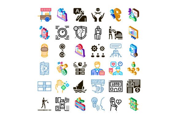
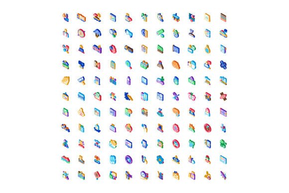
Business Technology Health & Education Icons
Icons aren’t just decorative—they’re functional shorthand. When you’re designing an infographic for a healthcare startup’s investor pitch, building a learning module for remote employees, or crafting a social media campaign for a fintech app, the right icon instantly signals meaning, builds trust, and guides attention. That’s where Business Technology Health and Education icons stand out: a cohesive, intelligently curated set that bridges six critical domains—business, technology, communication, education, finance, and health—without visual contradiction or conceptual overload.
More Than Just Six Categories—It’s Cross-Domain Clarity
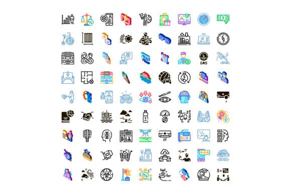
This isn’t a random collection of clipart. Each icon is designed with consistent stroke weight, corner radius, alignment logic, and negative space treatment—so whether you’re pairing a “data analytics” glyph with a “patient journey” flowchart or overlaying a “digital classroom” icon on a university course page, everything feels intentional and unified. The set avoids over-stylization (no neon gradients or exaggerated shadows) and under-design (no flat, lifeless silhouettes). Instead, it lands in that sweet spot: clean enough for enterprise dashboards, expressive enough for learner-facing materials, scalable without pixelation, and legible even at 16px.
Why These Six Domains Matter Together
Real-world problems rarely stay inside one silo. A school district rolling out a new LMS needs icons for technology (cloud sync), education (interactive quiz), communication (parent notification), and health (wellness check-in). A small business owner launching a telehealth side-hustle uses the same set to illustrate service tiers, secure payment flows (finance), HIPAA-compliant data handling (technology + health), and client onboarding steps (business + communication). That interoperability—across context, audience, and platform—is what makes Business Technology Health and Education icons unusually versatile.
Where They Deliver Real Value—Not Just Visual Polish
Consider three common scenarios:
- Internal training decks: Replace walls of bullet points with icons that map directly to workflow stages—e.g., a “collaboration” icon next to a team feedback step, or a “compliance” symbol beside a data-handling policy. Learners retain 65% more information when visuals support text (per NN/g research), and consistency across modules reduces cognitive load.
- Startup website navigation: A fintech SaaS site might use the “secure transaction” icon in its pricing table, the “real-time dashboard” icon in feature highlights, and the “mobile-first access” icon in its responsive design section—all drawn from the same visual language. That coherence tells users, without saying a word, “We’re integrated, not pieced together.”
- Educational infographics for adult learners: Think of a public health nonprofit explaining vaccine distribution logistics. Pairing a “supply chain” icon (business) with a “cold chain monitoring” icon (technology + health) and a “community outreach” icon (communication + education) makes complex systems feel navigable—not intimidating.
Practical Considerations Before You Download or License
Not all icon sets wear well over time—or across tools. Here’s what to check before committing:
- File format flexibility: Look for SVG (for web scalability), multi-layered AI/EPS (for precise color or stroke edits), and PNG variants (with transparent backgrounds, at multiple sizes). Avoid sets delivered only as raster JPEGs—they’ll blur on high-DPI screens.
- License scope: Does it cover commercial use? Internal presentations? White-labeled client work? Some licenses restrict redistribution—even in editable templates. Read the fine print, especially if you’re a freelancer bundling assets into deliverables.
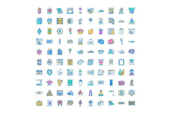
- Color system compatibility: Does the set include variants in your brand’s primary, secondary, and neutral palettes—or at least clear guidance on how to recolor without breaking proportions? Monochrome versions matter too: think printed handouts, accessibility modes, or grayscale PDF exports.
- Contextual naming: File names like
icon-042.svgare frustrating. Prefer sets where icons are named descriptively—health-electronic-record.svg,finance-transaction-fee.svg,education-quiz-feedback.svg. Saves hours during asset audits or handoffs.
A Note on Accessibility & Inclusion
Good icons don’t rely solely on shape or color. The strongest Business Technology Health and Education sets include subtle but meaningful visual cues: a “remote learning” icon shows both a laptop and a headset (not just one), a “financial inclusion” icon depicts diverse hands exchanging a digital token, and a “mental wellness” icon avoids stigmatizing tropes (like broken chains or storm clouds) in favor of grounded, human-centered metaphors (a balanced scale, a breathing rhythm line, a supportive circle). Always pair icons with concise, plain-language labels—especially in digital interfaces—so screen readers and non-native speakers get equal clarity.
How to Integrate Without Over-Designing
Resist the urge to use every icon at once. Start with restraint: pick *three* that anchor your core message. For example, a community college’s workforce development page might lead with: “Learn industry skills” (education + technology), “Earn recognized credentials” (business + finance), and “Access career coaching & wellness support” (communication + health). That’s focused, scannable, and emotionally resonant—no visual noise.
When customizing, tweak sparingly. Adjusting stroke weight by 0.5pt or shifting saturation by 5% preserves integrity; swapping out entire visual metaphors (e.g., replacing a “cloud server” icon with a “data center building”) breaks cohesion. And remember: icons support content—they don’t replace it. If your message still needs paragraphs to land, add them. The icons are there to accelerate understanding, not substitute for substance.
Whether you’re sketching wireframes, building Notion dashboards, prepping investor decks, or updating a hospital’s patient portal, Business Technology Health and Education icons offer something rare: precision without rigidity, breadth without bloat, and professionalism without pretense. They’re built for people who solve real problems—not for trend-chasing or empty aesthetics. Use them to clarify, not decorate. To connect, not distract. And above all—to make complex ideas feel human again.
